
How To Design Engaging and Effective Presentations
By Rachel Kats
PowerPoint presentations can be a powerful way to share ideas, but only if they’re designed with the audience in mind. Whether you’re preparing for a city council meeting, staff training, or community event, the goal is more than delivering information — it’s making that information clear, memorable, and engaging.
Here are practical tips to help you structure and design presentations that connect and keep attention from start to finish.
Know your audience: Everyone learns differently
People bring their experiences and expectations to any presentation. They want content that’s practical, relatable, and respectful of their time and knowledge. Here’s how to meet those needs:
- Use stories, analogies, and real-world examples.
- Avoid too much detail by simplifying and prioritizing the material you share.
- Pause often to let information land.
- Interact rather than lecture.
- Avoid insider jargon or acronyms that can exclude or confuse your audience.
Structure matters: Beginning, middle, end
Think of your presentation like a story: it needs a strong start, a purposeful middle, and a clear ending. Each phase helps your audience stay focused and get the most out of the content.
Start strong
Your opening should set the tone and clarify expectations. Let your audience know what they’re going to learn and why it matters. A good opener might include:
- A brief agenda and messaging objectives.
- A personal story or real-life example.
- A quick audience warm-up like a “think-pair-share” activity, where you give attendees 30 seconds to think about a question and then ask them to turn to someone next to them and share their answer.
- An explanation of why the topic is relevant right now.
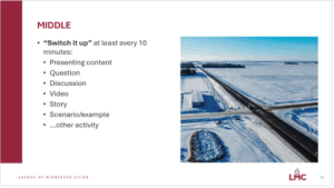
The middle: Break it up
Adults retain more when content is delivered in chunks. A good rule of thumb is to switch it up every 10 minutes. You can do this by:
- Asking a discussion question.
- Playing a short video.
- Sharing a case study or scenario.
- Facilitating a quick poll or breakout conversation.
If you’re an expert in your field, it’s easy to go too in depth, too fast. Remember: you can share your gallon of knowledge, but do it 4 ounces at a time. Present what your audience can absorb, not everything you know.
Close with purpose
Wrap up by reinforcing the most important takeaways. Give your audience time to reflect. One simple way to do this is with a “start, stop, continue” activity:
Based on what we’ve discussed today:
- What’s something you’ll start doing?
- What’s something you’ll stop doing?
- What’s something you’ll continue doing?
Also consider providing a slide that lists additional resources and another that includes key takeaways.
Design for engagement, not just information
every 10 minutes
Your slides are a tool, not a script. The goal is to have the presentation slides support what you’re saying, not to repeat it word-for-word.
Here’s how to make your slide design work for your audience:
Keep it consistent
Starting with a template helps ensure consistency in branding and professionalism. It also makes your presentation easier to follow. When the layout, colors, and font styles are predictable, people can focus on the content instead of figuring out how to navigate each slide.
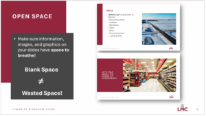
Use white space
Blank space isn’t wasted space. It gives the eye and brain a break. Stick to a clean layout with limited elements on each slide — three per slide is a solid target (e.g., title, image, and one short text block).
Simplify text
- Avoid large blocks of text.
- Use bullet points when possible.
- Increase line spacing for readability.
- Don’t write out your presentation script, use speaker notes instead. Speaker notes are private reminders that only the presenter sees, helping them explain slides smoothly without adding clutter or relying on paper notes.
Keep accessibility in mind
- Use high-contrast colors (dark text on a light background is best).
- Avoid using color alone to highlight information (use other ways of labeling, or bold/italics).
- Stick to clear, readable (preferably sans serif) fonts, and consistent formatting.
Add visuals
Images and videos can boost engagement, but be sure they’re high quality, free of any copyright restrictions, and not too busy. Videos should be short, ideally under three minutes, and always include captions for accessibility. Tools like Vimeo and YouTube can help generate video captions, but always review and edit any autogenerated captions for errors.
Practice and pause
When presenting, most people talk too fast. Practice slowing down and leaving pauses, especially after important points. It feels awkward at first, but it gives your audience time to absorb what you’re saying.
And if you’re feeling overwhelmed while building your slide deck, start with your messaging objectives and work backwards. Decide what you want people to walk away with, then build your presentation around that.
Less is more
You don’t need fancy animations or 30 slides to make an impact. A few well-designed slides, a clear message, and thoughtful pacing can go a long way. Focus on helping your audience learn — rather than proving how much you know — and your next presentation will be one they remember.
Rachel Kats is publications and web editor at the League of Minnesota Cities. Contact: [email protected] or (651) 215-4032. Adriana Temali, LMC learning manager, and Kelsey Larson, LMC learning designer, contributed to this article.